Mild Child Skates
Brief
Mild Child Skates is a skateboarding equipment and apparel company for Gen-Z women. It celebrates the innovation and rebellious spirit of skate culture, while fostering inclusive and supportive community. Relaxed and causal, the brand gently offers an alternative to edgier skate aesthetics.
Deliverables for this project included: a logo, a board design, two apparel designs, and a poster design.
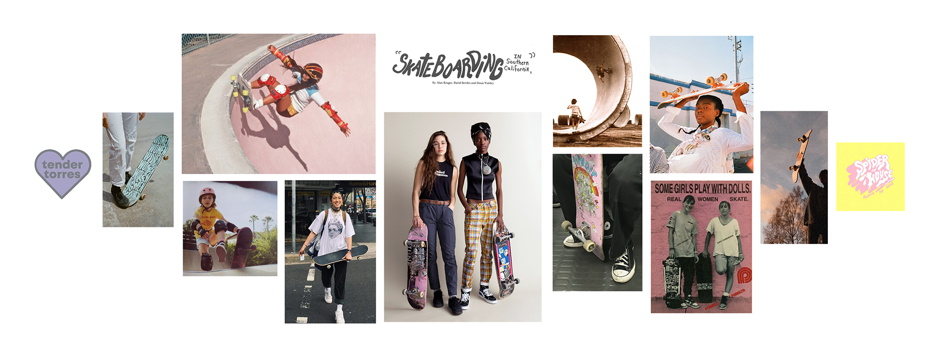
Moodboard
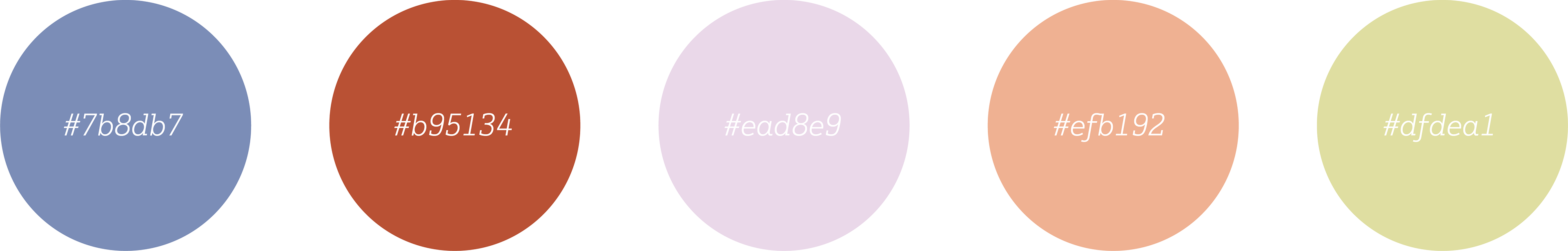
Color Palette
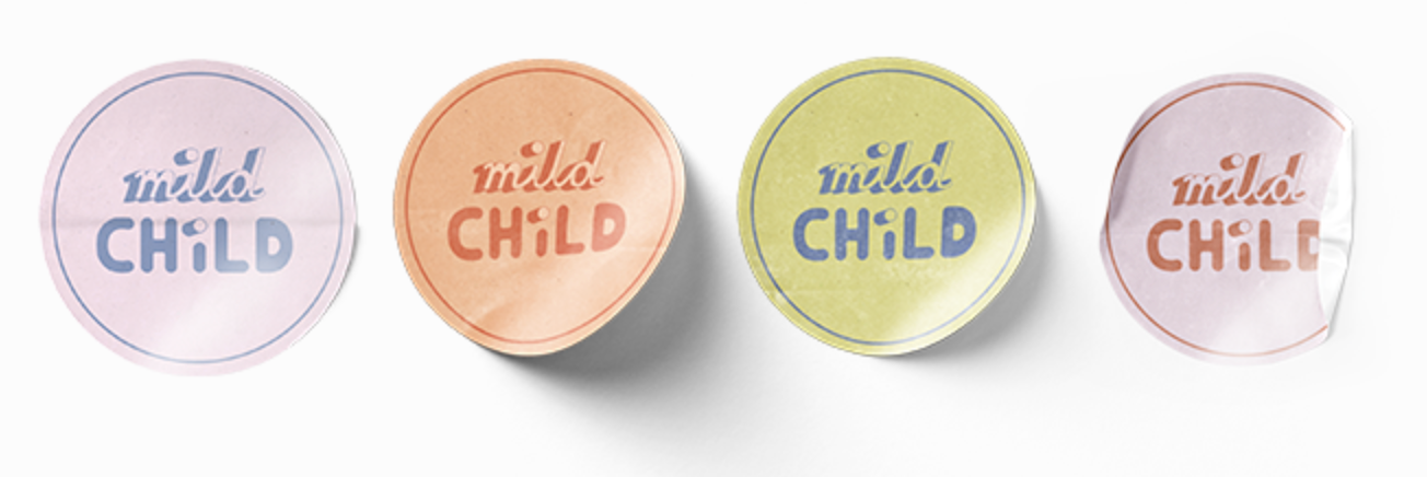
LOGO
The logo combines soft script with bold sans serif. The typography was inspired by handwritten 'bubble letters' and drop shadows creating a youthful, carefree, and DIY mood. It is simple enough to be legible even at small scales or in black and white. The pastel brand colors bring a summery ease and laid back charm.
Board Design
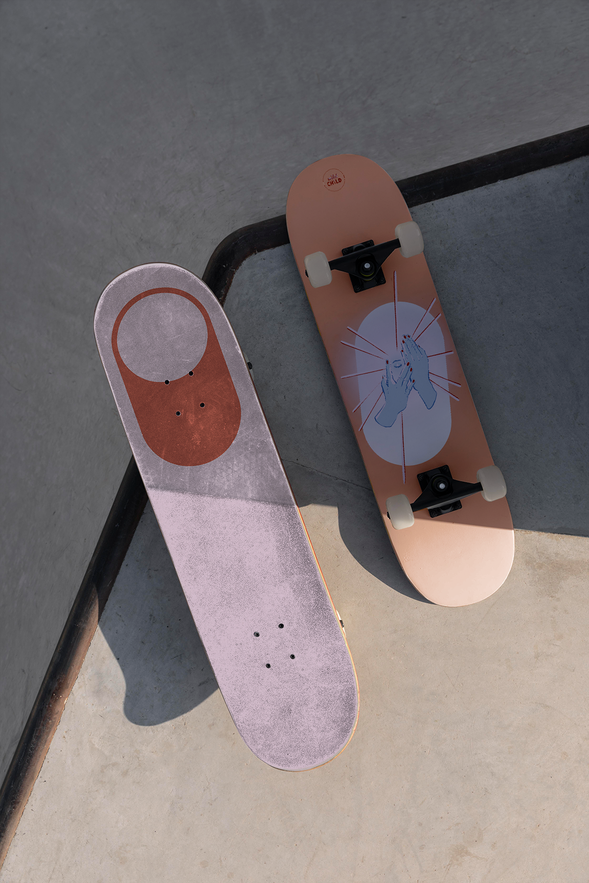
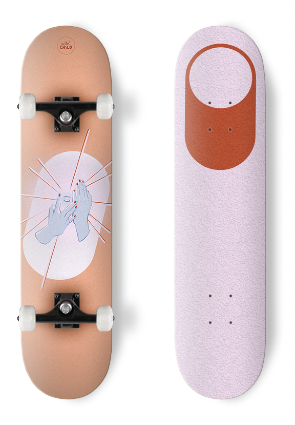
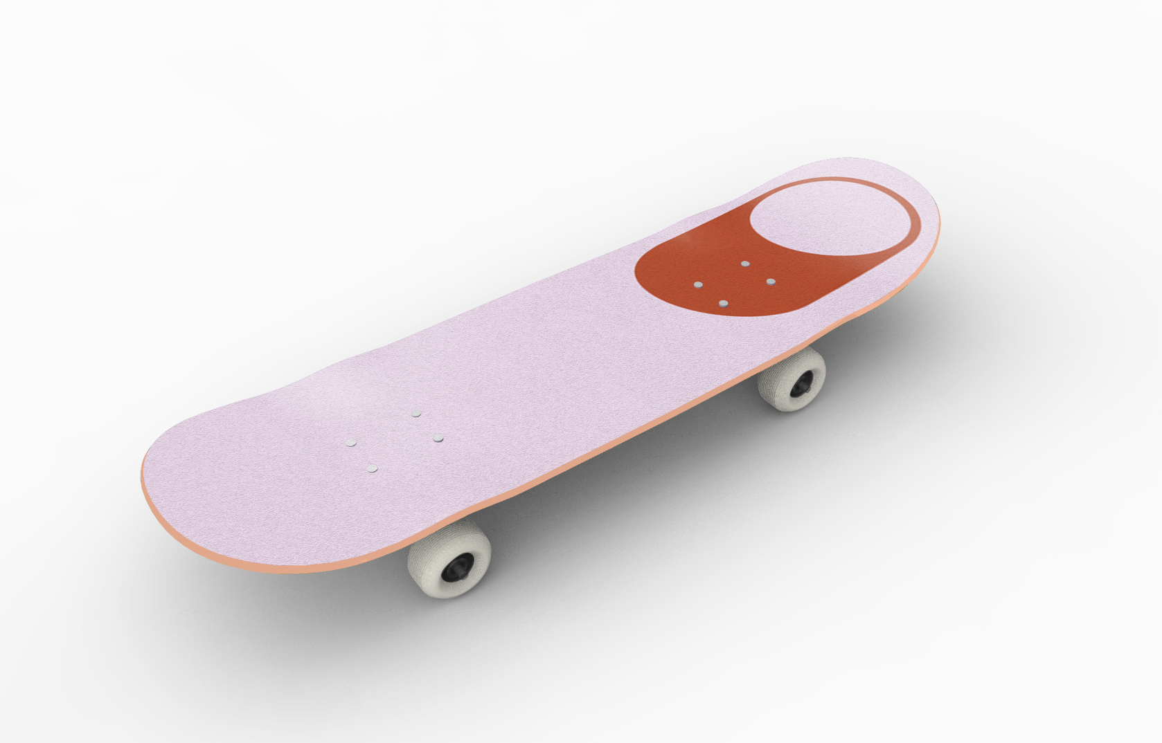
In the design of the first skateboard, I incorporated an element of the logo on the upper face of the board. The textured grip tape would make small details difficult to read, so I turned the design into a simple graphic element. The shape that dots the 'i' in 'mild' and 'child' now mirrors the shape of the board itself. On the reverse, the illustration plays on the brand name. Two hands cover a face in a bashful, childish peekaboo.
Apparel Design
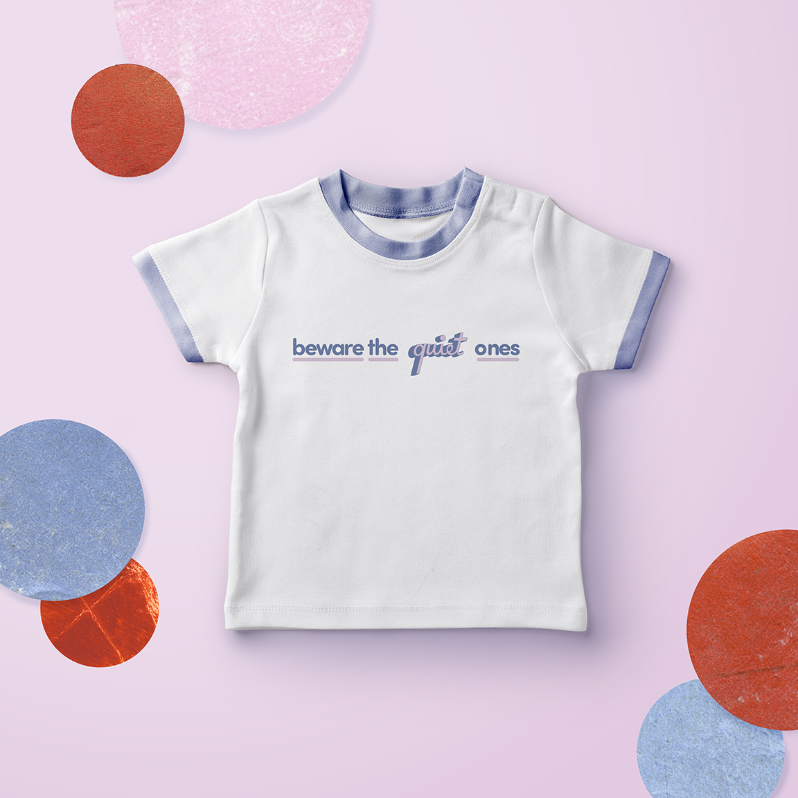
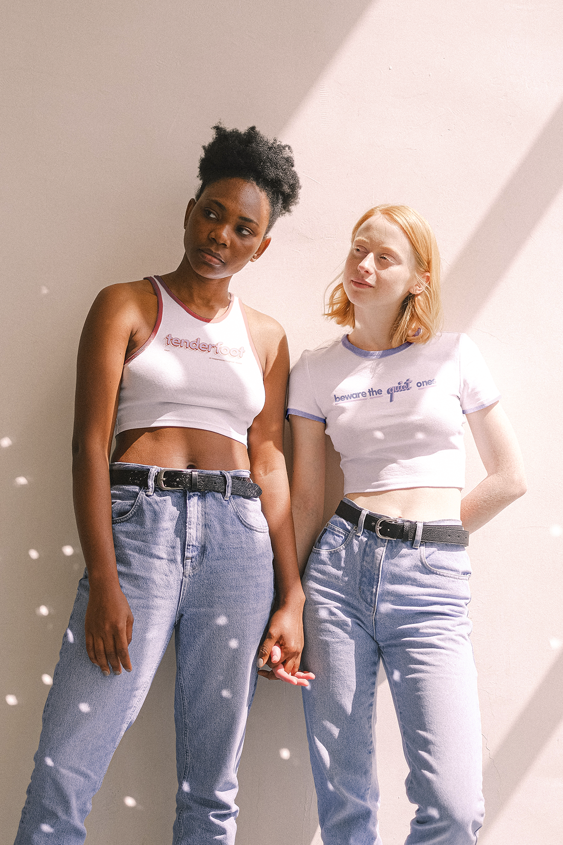
The first piece of apparel from the brand is a reclamation of a phrase used to taunt quiet people. People who are shy are often categorized either as silent masterminds, or naive and demure. For people who are typically seen as timid or twee because they are quiet, wearing the shirt is a tongue and cheek reminder that they are not to be talked down to. Applying the phrase to yourself ironically recognizes that your shyness does not indicate a lack of strength, ambition, or ability. The soft lavender, muted pink, and rounded lowercase typefaces imply innocence and tenderness, in contrast to the phrase itself.
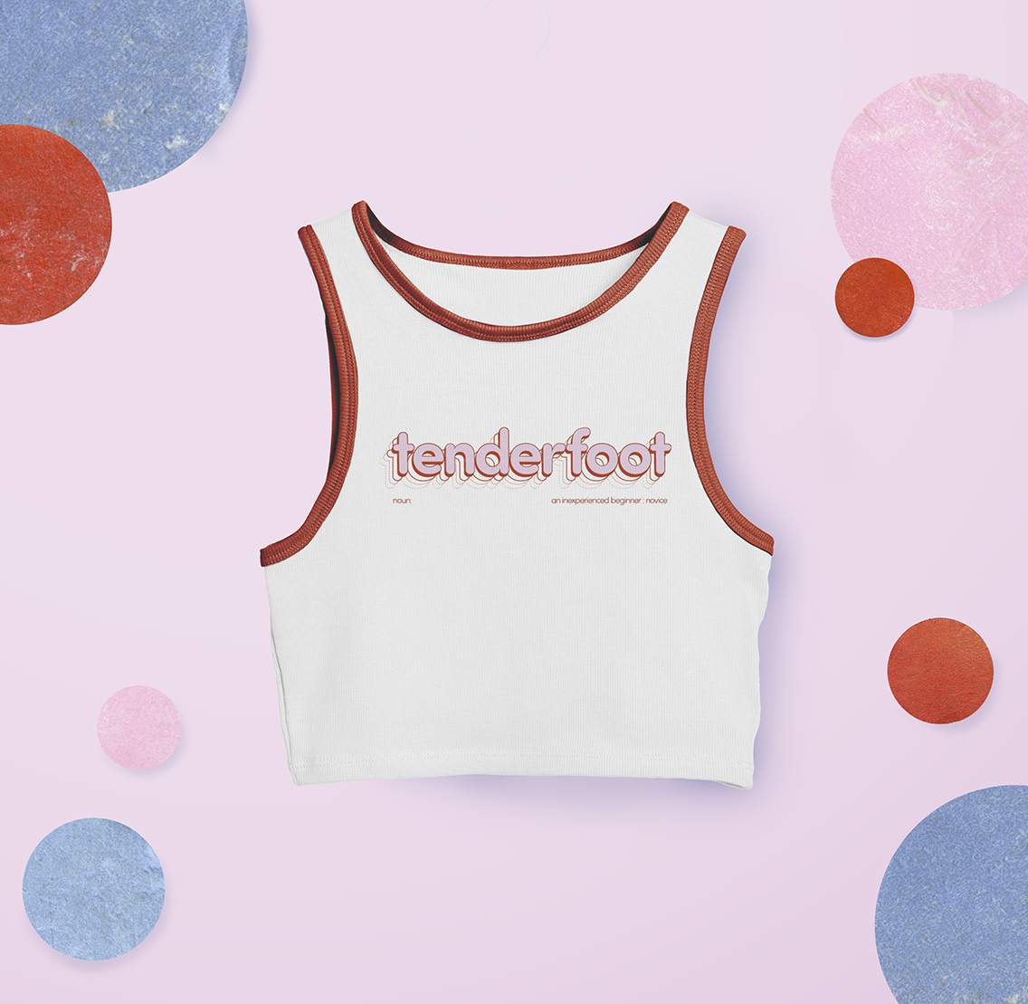
The second piece of apparel for the brand encourages newcomers to embrace the fact that they are learning a new skill, and identifies them as someone to lookout for and help rather than ostracize. Skateboarding can be elitist and harsh towards beginners learning the basics. Having designs geared toward them can help shift attitudes about who skating is for. Women and queer people have historically been shunned from skating, but in recent years have carved out respected spaces for themselves in the scene.
The word is close reference to 'goofy foot'—someone who skates with their left foot on the back of the board. Most skaters put their left foot forward, in a regular stance. Both stances are accepted, implying that there is no wrong way to skate, just ways to innovate.
Poster Design
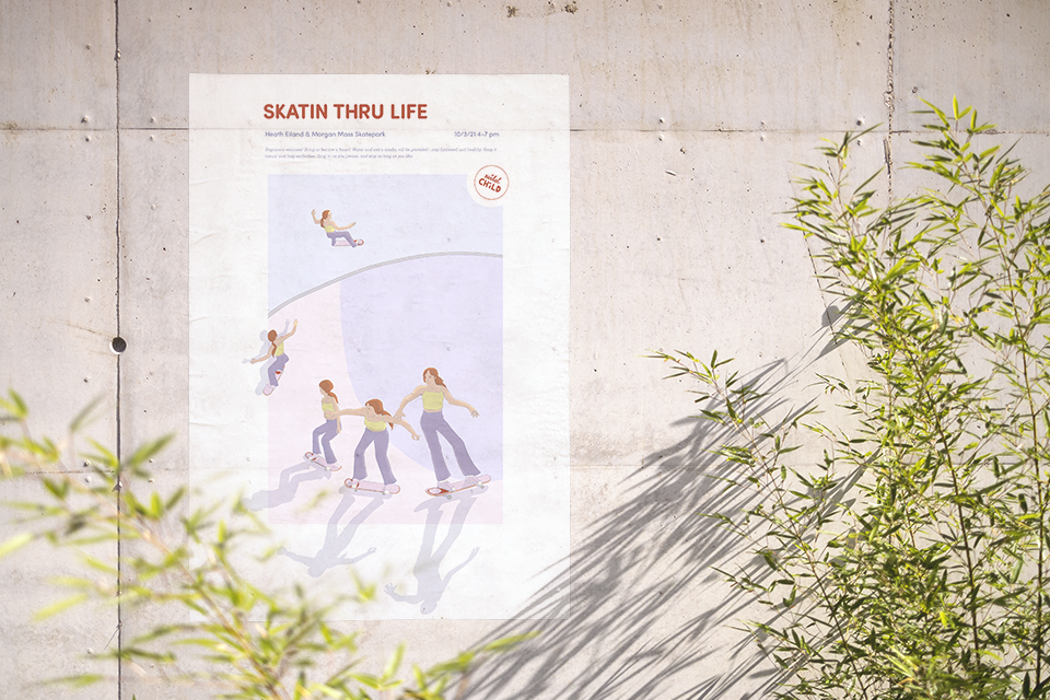
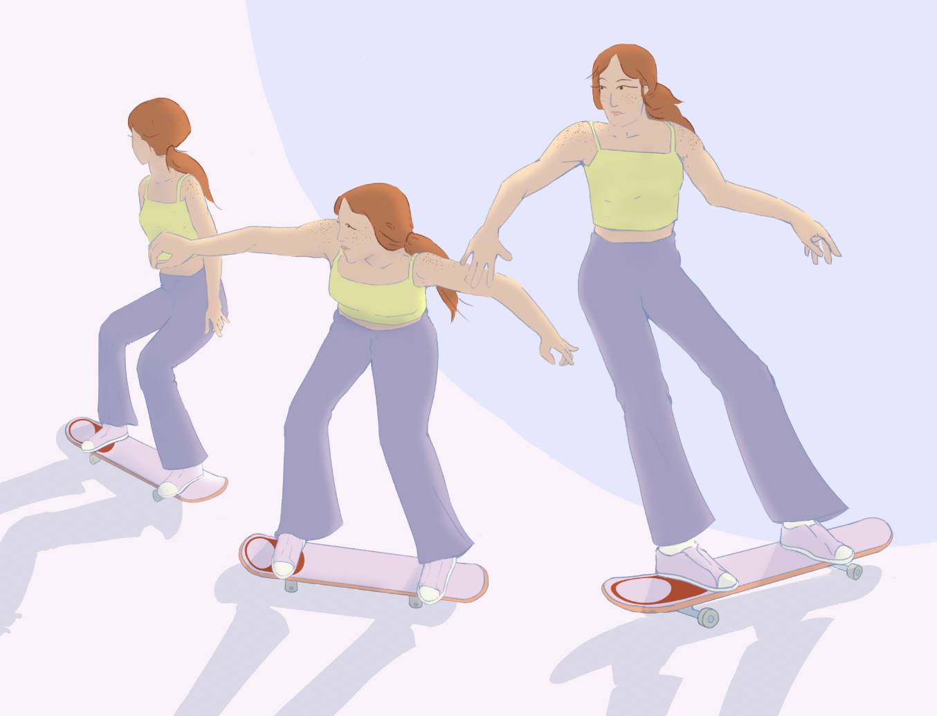
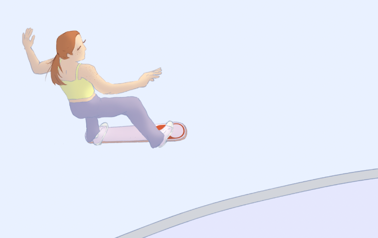
Finally, I designed and illustrated a poster promoting a local event. The low, warm light creates a relaxed and calming golden hour atmosphere.